
Specular is the ability of a material or surface to
reflect light. (in other words, show shininess)
it is important as a pixel artist or spriter
that you know the physical qualities of your object’s
materials in your art. and specular is one thing
that you should not ignore.
Mirrors have the most powerful specular…
and as you know Glasses also are sensitive to
light sources that it can have shiny parts on it
that make it glossy.
OK today’s lesson is all about setting and planning
how much shininess an object in your pixel art should
impose. this lesson will show you how to determine
the right color to pick for use with the object’s specular
qualities and show it’s shine.
and as you now, not all materials reflect light or
show glossiness. one example is a rubber,
rubber is a material that do not have specular value.
it can have shadings but no glowing or glossy parts
should be applied to rubbers.
on the other hand, there is a material called ‘plastic’.
most plastic shows very high specular.
and ofcourse, materials like metals have high
speculars too… gold, silver, brass, copper, etc…
they all show shiny parts on their body everywhere
whenever a light source is present.
here’s some examples of materials.
MATERIAL SPECULARS
figure1
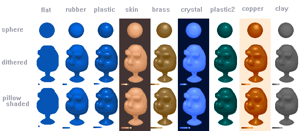
you should always observe your object’s material characteristics
whenever you start pixelling a subject.
Rubber – low specular, can’t have shiny parts
Plastic – very high specular, the shiny spot is almost a solid color
Skin – below average specular, specular depends on how sweaty the skin is.
Brass – high specular.
Copper – high specular. high contrast.
Crystal or Glass – high specular, low contrast, high brightness.
Clay (modelling clay) – low specular, low contrast.
before you begin your pixel art
you should make it a habit that you
always pick the necessary colors and
arrange your pallete.
if you use paint and/or other program
you should always get yourself aquainted
to the Color dialog window
figure2

that’s the place where you can adjust colors
on your pallete.
next, ofcourse you should know what colors to pick
if you are going to start to pixel an object you should
first pick the base color for the object.
figure3
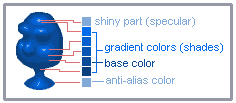
this figure shows the plastic material and the colors
(pallete) used with it.
Base Color – is the diffuse* color for the material. you can create shades of it by adjusting its RGB** and a little on it’s HSV*** value and assign them to pallete.
Gradient Color (Shades) – these colors originated from the base color. they used to make the artwork look realistic and non-flat.
Shiny Part (Specular) – finally this is the color you need to act as the shiny part of the material. it should be bright as the light source color, mostly white.
Anti-Alias – the extra color used for AAing.
*=diffuse means the overall color of an object. (base color)
**=RGB means the Red, Green, Blue color values of certain image
***=HSV means the Hue, Saturation, and Value of the color of the image
now the coloring of your artwork and the question
on where to place the shiny spot mostly depends
on the light source position and the shape of the object.
please study and take a deep look at the figure1.
and see how i place the shiny spots on the object.
mostly shiny parts will appear on the bumpy area of an object.
or any parts that obviously protrudes.
lastly, consider this following figure
figure4
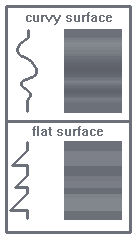
curvy and bumpy areas are the most places you can find
the glossy or shiny part.
the figure shows the difference between flat and curvy
surface. as you can see curvy surface have more certain
to show specular.
-note that flat surfaces may not have shiny areas.
HINTS:
look at the things at your household. bottles, glasses, toys, anything…. and observe their speculars.
concentrate on the shape of your lineart. (bottle)
then try to look at those curvy area. try to imagine
what area in the object should the light hit to.
some shiny shapes are dependant on your objects
shape.
for further demonstration
here’s a figure that shows
step by step procedure…..
figure5
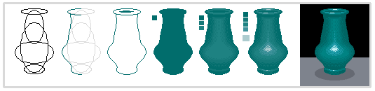
this is my procedure on doing the bottle pixelart
(following this step by step procedure is optional, what important
is the way you impose the specular on the object of your art.)
you can do whatever way you want to use.
step 1 : if you dont have a reference model, just put in some circle shapes and reform them to make a bottle figure
step 2-3 : trace the shape and complete the lineart of the bottle
step 4 : apply the base color of the bottle
step 5 : apply shadings on it, this is the part where you have to decide whether to make the material non specular or a shiny one… and also consider some other aspects like material’s shape, brightness and contrasts. for example. ‘some plastics has high contrasts’,’skins have low contrasts’. etc…
step 6 : apply the specular (shiny spot) on the object. remember, specular’s position and size is affected by the light source’s size and position.
step 7 : add some finishing touches and some refinement (AAing, background, etc..)
ok guys, always be aware of every objects, things around you
and study their physical characteristics. have them sketch with pencil
colors or any method that lets you memorize how to draw them.
Regards
Teej

Comments