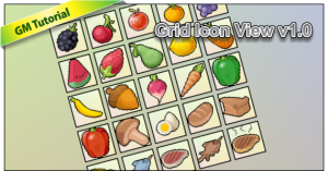
Are you one of those Game Maker’s who still present your game’s player inventory icons in a static way? meaning you’re positioning each image manually with some hard coded bunch of if conditions to show which icon image you like to appear? You know, that’s not the best way to go. You need to have a more dynamic and flexible graphical interface.
If you are interested in doing such a graphic presentation of your game icons into a dynamic, organized in a grid or table like pattern with minimal effort in image setting… then you should take this example and learn how to do it.
The main work horse in this example is the “for loop” statement, wherein it basically keeps repeating a certain code which controls which image to draw, and where to position it.
There is actually 2 for loops working, the first one works for building the horizontal slots part, the other is for building vertical slots… thus, generating a grid or a table when finished.
The example has 6 initial variables:
rows is the number of rows in the grid view
cols is the number of columns in the grid
cellsize the square size of every grid cells (in pixel)
gridposx x position of the grid on the screen
gridposy y position of the grid on the screen
cellspc the offset or margin space for each cell
This example is capable of more advanced features like:
- Embedding any tags on each cell. e.g. name, cost, id, or any relevant tags you can attach.
- Resizable cells, wherein you can set the grid scale width and height, and the cells will automatically resized.
- Have custom size, instead of having a square icon size, you can specify a any custom size for width and height.
- Implement a data base structure to store items data with.
All those features will be put into a demo in the next version of this example next time.


Good example, I can’t wait for the more advanced one… Ima gonna need this for my game.