The probable new face of Game Maker has now been unveiled, the new logo which has appeared with the new website design of YoYoGames didn’t aroused many attention at first, until it was brought up to Game Maker Community that made the logo in question received some criticisms which eventually turned into a fuss then alarmed moderators to have the topic closed.
Honestly, I was one of those who felt that the new logo was not the best design especially at this time when Game Maker seems to improving on all aspects. However I still gave enough constructive criticisms and here I quote:
I kinda don’t like it much, I’d rather keep the current logo… however, that new design is somewhat relevant to GM status today I reckon;
1. The 3d-ish and textured look gives me an impression of the improvements in GM’s 3d capability.
2. 3d Shape of the cog is less curvy/rounded and somewhat flat surfaced, may mean that GM’s 3d function.. though capable, its 2d graphics performance will still outlast.
3. The removal of side view smiling Pacman icon gives me the impression that GM is not just a kid’s stuff anymore.
4. The minimal color theme and lack of glossy effect means to me like GM is more serious now. (hmmm…. and less friendly? i dunno)
5. Picking a darker theme (in relation to the website design) means to me like YoYoGames are in their dark basement busy developing the next GM, and telling us ‘just you wait’.But yeah I still like the current logo/icon of Game Maker 8x.
That new logo to me looks a bit uninviting, not very bad, but somehow the color combination used just doesn’t sell it to me. I wonder if new GM versions GUI would be color themed similar to that logo, but oh well, it won’t bother me much I guess.Well… those we’re just my opinion.
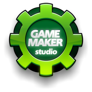
Urging my fondness on the previous logo design I posted and voiced my opinion again this time I also attached a logo rendition I designed based on the GameMaker v8 logo.
I think there’s something wrong in that new logo that to some may be obscure. It just doesn’t shine… I think its the color really, it’s dark and lacks saturation or vividness… the shape (low polygon style) also contributes to its somewhat outdated appearance. I am not young, although not that old either, but the GameMaker8x logo attracts me more.
I don’t discredit YYG’s artist, the logo he made is good judging from the quality of the image.. it appears to be very clean, well done there! but the aesthetics is where it lacks. Maybe consider some modification.
Mike says he likes the GameMaker8 logo, I’m happy to hear that. Because I just tried my hand at creating a similar logo…
– I removed Pacman because he is not needed anymore because he represents somewhat child’s play.. GM has to grow.
– I didn’t use the “G” because frankly “G” can mean anything, even if you put it on a cog. (I’d rather use “GM”)
– There is another cog behind the front cog, that cog on the background represents the foundation that Mark, YoYo and the community built for GM.
– I added glow effects, means that GM (after those humble years) is now a renowned Game Development tool. It deserves to shine.Ok, my logo may have some issues around it if you look closer… well its just a draft anyway.
In the end, YoYoGames company is the sole decision makers in this and not the users and its community. I just hope they would consider some modification to the new logo if possible.


Comments